Your footage looks flat. Washed out. Like you filmed it through a sandwich bag. Sound familiar?
This is the moment most new creators either give up on color or go full chaos mode, cranking saturation until their face looks like a tomato. Neither is the move.
Here's the truth: YouTube color grading is way more approachable than people make it sound. You don't need to know what a vectorscope is. You don't need a film degree or a $400/hour colorist. You just need to understand a few basic concepts, and you can get footage that actually looks intentional.
Why Color Grading Actually Matters on YouTube
I know what you're thinking. "My content is good enough, people watch for the value not the visuals." And yeah, up to a point, that's true. But here's the thing: color affects how professional your channel feels at a gut level, often before someone even consciously registers it.
Dull, gray, underexposed footage signals "amateur" to a viewer's brain in about half a second. It doesn't matter if your script is brilliant. First impressions are visual.
And the flip side is also true. A clean, well-graded video makes people trust you more. It signals that you care about your craft. That trust translates to watch time, subscriptions, and all the things the algorithm rewards.
The Difference Between Color Correction and Color Grading
These two terms get thrown around interchangeably and it drives me a little crazy, because they're actually different steps.
Color correction is fixing problems. You shot in bad lighting and your footage looks too orange. You fix that. Skin tones look greenish. You fix that too. It's about getting your footage to look "normal" and accurate.
Color grading is adding intention. Once your footage looks correct, you apply a style. Maybe a warm, golden tone. Maybe something cooler and more cinematic. This is where your visual identity as a creator comes from.
Think of correction as cleaning the canvas. Grading is the actual painting.
Start With Primary Correction (This Is Non-Negotiable)
Every professional colorist works in layers, and the first layer is always primary correction. For beginners, this means adjusting three things: exposure, white balance, and contrast.
Exposure is just brightness. Is your subject too dark? Too blown out? Fix this first. White balance is the color temperature of your footage. Tungsten lights make footage orange. Overcast skies make it blue. You adjust until white things look white and skin looks like skin.
Contrast is where things start to get interesting. Lifting your blacks slightly and pulling your highlights down gives footage that softer, more "cinematic" look you've probably noticed on bigger channels. It's subtle but it matters.
Most editing software, whether you're in Premiere Pro, Final Cut, CapCut, or DaVinci Resolve, has basic sliders for all of this. You don't need to touch anything scary yet.
The LUT Shortcut (And How Not to Overuse It)
A LUT (Look Up Table) is basically a preset color grade. One click and your footage goes from flat to cinematic. This is genuinely the fastest way to start getting good-looking footage without knowing much about color theory.
Tons of creators give away free LUTs, some popular YouTubers have even released the exact LUT they use on their own channel. Worth hunting around for one that fits your content style.
But here's where people mess up: slapping a LUT on uncorrected footage looks terrible. Always do your primary correction first, then apply the LUT at around 50-70% opacity instead of 100%. Full strength LUTs almost always look overdone. Dial it back. Be subtle. Subtlety is what separates "graded" from "filtered."
The One Thing That Will Ruin Your Color Grade: Skin Tones
This is the most important thing in this entire post, honestly.
You can do wild things with backgrounds. You can make skies teal, shadows deep blue, whatever. Viewers will roll with it. But the second a face looks wrong, the whole video falls apart. Waxy skin. Greenish undertones. Overly magenta cheeks. Viewers notice this immediately, even if they don't consciously know why something feels off.
When you're grading, always check your skin tones last before you export. Step back from the screen, look at a full-size frame of your subject's face, and ask yourself honestly: does this look like a real human being? If you're unsure, you've probably pushed something too far.
Fancy tools like the vectorscope in DaVinci Resolve actually have a "skin tone line" that shows you exactly where faces should land. But honestly, your eyes are good enough for a sanity check if you remember to do it.
DaVinci Resolve Is Worth Learning (Even If It's Intimidating)
I'm not going to pretend the color page in DaVinci Resolve doesn't look like the inside of a NASA control room. It's a lot. But here's the thing: you don't need to touch most of it.
For beginners, the Color Wheels and Curves panels are enough to do 90% of what you need. Shadows, midtones, highlights, and a few curve adjustments. That's genuinely it for a solid beginner grade. Everything else can wait until you're more comfortable.
DaVinci Resolve is free for everything you need as a YouTube creator. Premiere Pro and Final Cut both have solid color tools too. Pick one and actually spend time with it rather than bouncing between apps every month.
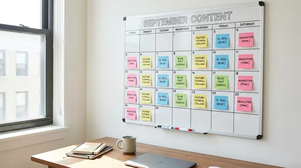
For everything else about your production workflow, from scripting to optimizing titles, Voclify has tools built specifically for YouTube creators. It won't color grade your footage obviously, but it can save you hours on the writing and research side so you actually have time to work on your visuals.
Building Your Consistent Visual Style
Here's something most beginners don't think about: consistency matters as much as quality. A look that's slightly imperfect but totally consistent across every video makes your channel feel cohesive and professional. A different vibe every video, even if each one is well-graded individually, makes your channel feel scattered.
Once you find a grade you like, save it. Most editing software lets you save color presets or "grades" that you can apply to future projects in seconds. Do this. Build your template. Apply it as a starting point every time.
This is also how you start developing a visual identity, which is one of those things that's hard to explain but you know it when you see it. Think about the warm, golden look that travel creators love. Or the clean, slightly desaturated look that tech channels tend to use. Those aren't accidents. They're deliberate style choices repeated consistently over time.
- Always correct before you grade. Fix exposure, white balance, and contrast first before adding any style.
- Use LUTs at reduced opacity. 50-70% usually looks way better than 100%.
- Guard your skin tones. Faces are where bad grades get noticed first.
- Keep it subtle. If you're not sure you've gone too far, you probably have.
- Save your grade as a preset. Consistency over time beats perfection on one video.
- DaVinci Resolve is free and more than enough for everything you need starting out.
Real talk: you're not going to nail this on your first try. Your second video will look better than your first. Your tenth will look better than your fifth. That's just how it goes.
The biggest mistake I see beginners make isn't bad color grading. It's ignoring it entirely and assuming it doesn't matter. It does. Not because YouTube demands cinematic production value, but because putting effort into how your video looks signals to your audience that you're serious about what you do.
Pick one software, watch a few focused tutorials on the color tools specifically, and just start experimenting. Give yourself permission to mess it up on a few videos. That's the only actual path forward.
And if you want to see how top creators structure their visual workflow alongside their content strategy, check out some of the other posts we've written on production and channel building. There's a lot more to the puzzle, but color is one of the most underrated pieces of it.