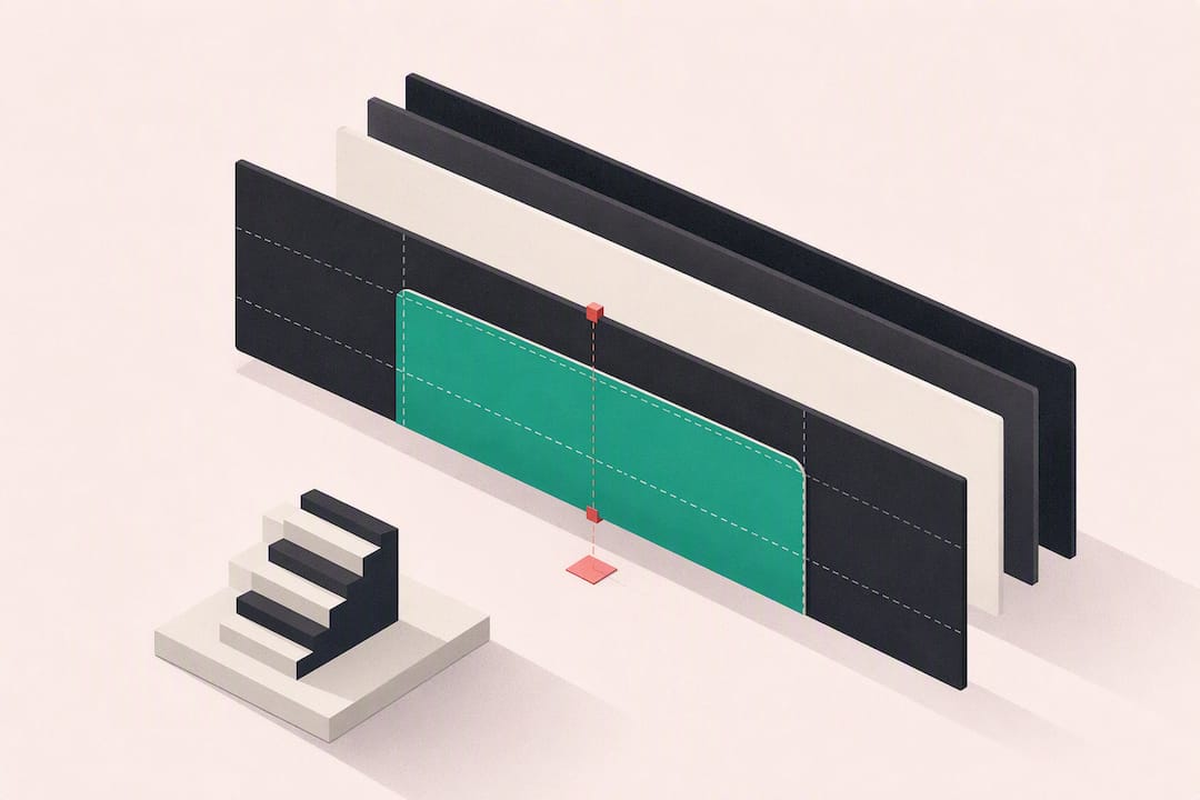
Design your channel banner at 2560×1440 px, keep every headline, logo, and schedule detail inside the centered 1546×423 px safe area, and export as a PNG or JPEG under 6 MB. That single combination is what separates a banner that looks sharp on a phone, desktop, and TV from one that gets cropped into an unreadable mess. Everything else in channel banner design is refinement on top of that foundation.
TL;DR:
- Use a 2560×1440 pixel canvas with critical elements inside the centered 1546×423 px safe area to ensure your banner displays correctly on all devices.
- Keep files under 6 MB and export as PNG for text-heavy designs or JPEG for photo backgrounds to ensure compatibility and fast loading.
- Focus on a single clear message and visual style that matches your thumbnails, rather than overloading the banner with information or complex designs.
- Check your banner on actual devices, including mobile, desktop, and TV, to catch cropping issues, pixelation, and contrast problems before finalizing.
- Regularly update the banner to reflect content shifts and seasonal campaigns, avoiding outdated information that can damage your channel’s professionalism.
What Size Should Your YouTube Banner Be?
YouTube’s own spec is the starting point: build your file at 2560×1440 px, and treat the centered 1546×423 px zone as the only space where critical elements are guaranteed to show. Anything outside that safe area might get clipped depending on whether someone’s viewing your channel on a phone, a laptop browser, or a living room TV, according to YouTube’s channel branding guidance.
A few technical rules matter just as much as the dimensions:
- Minimum acceptable upload size is 2048×1152 px, but 2560×1440 px gives you room to scale without quality loss.
- Keep the file under 6 MB. Larger files get rejected or fail to upload in YouTube Studio.
- Export as PNG when your banner leans on text (crisper edges) or JPEG when it’s photo-heavy.
- Leave 30 to 60 pixels of inner padding inside the safe area so text doesn’t sit flush against the edge, since phone scaling varies enough to nibble at anything too close to the boundary, per Adobe Express’s design guidance.
Pro Tip: Build a template with three visible layers, the full 2560×1440 canvas, the 1546×423 safe area, and a padded inner zone. Reuse that template for every banner variant you ever make.
Seven Steps To Design A Channel Banner That Converts
Most creators overthink the art and underthink the message. Here’s a workflow that gets you from blank canvas to published banner in one sitting.
- Define the banner’s job first. Before you open any design tool, decide the one thing this banner needs to communicate, a single-line promise, plus the action you want a new visitor to take (subscribe, check upload days, click a link).
- Set up your canvas with a visible safe-area guide. Draw the 1546×423 px zone as a locked guide layer and design mobile-first, since that’s the crop most viewers will actually see.
- Write a headline of 7 to 12 words. Add an optional subline for upload cadence (“New videos every Tuesday”). Stick to one or two typefaces max, more than that and the banner starts looking like a ransom note.
- Choose imagery and colors that echo your thumbnails. If your thumbnails run a specific accent color or filter, carry it into the banner. Viewers register that repetition even when they can’t name why it feels cohesive.
- Lay out around the platform’s UI overlays. YouTube places your avatar near the bottom-left on desktop and often overlays subscribe/link buttons near the bottom-right, so keep your most important text centered-high rather than fighting those zones.
- Export with the right format for the job. PNG for anything text-heavy, JPEG for photographic backgrounds, and aim for a 2 to 4 MB file size even though 6 MB is the ceiling. Smaller files load faster without visible quality loss at this resolution.
- Upload, preview on real devices, then iterate. Don’t trust the editor’s preview alone. Pull up your channel on your actual phone before calling the job done.
Adobe Express frames this whole sequence around one habit: state a clear promise and match your banner’s visual style to your thumbnails, which does more for brand recognition than any single design flourish.
Which Tools Speed Up Banner Creation?
Starting from a blank canvas is the slowest way to design a banner. Templates built around the 1546×423 safe area let you skip the measuring and jump straight to messaging, as long as you check that the template’s placeholder text and logo actually sit inside that zone before you customize it.
A few tool categories cover almost every situation:
- Browser-based template editors for fast drag-and-drop banner assembly without design software.
- Photo editors for color correction and matching your banner’s palette to your thumbnails.
- AI upscalers when your source image is smaller than the full canvas. Test the upscaled result on a large display before finalizing it, since pixelation that’s invisible on a phone becomes obvious on a TV.
- Background removers for isolating a subject or product shot cleanly against a new backdrop.
- Guide-layer-capable editors that let you lock a safe-area overlay so you never accidentally place text outside it.
For creators managing multiple channels or running seasonal campaigns, keeping a set of banner variants organized (holiday version, launch-week version, evergreen default) saves you from rebuilding from scratch every time. Voclify’s Brand Studio is built for exactly that kind of draft-and-swap workflow, generating logo and banner drafts you can adapt without starting over each time your schedule changes.
How Do I Upload And Preview My Banner?
The upload path in YouTube Studio is short: go to Customization → Branding → Banner image, then upload your file. YouTube shows you a preview across a few device sizes right in that screen, but that in-app preview is a starting point, not a final check.
Run through this before you consider the banner done:
- Open your channel on your phone’s YouTube app and check that your headline isn’t clipped.
- Check the desktop browser view, where the avatar and subscribe button sit lower and can overlap poorly-placed text.
- If you have access to a TV or smart display, check there too. YouTube’s TV app crops differently than mobile, and this is where oversized background images often reveal pixelation, a detail confirmed across multiple banner design guides.
Common mistakes are almost always the same three: text placed outside the safe area, a file that exceeds 6 MB and silently fails to upload, and imagery stretched beyond its native resolution. All three show up immediately once you preview on an actual device instead of trusting the editor screen.
What Are Some Channel Banner Design Ideas By Niche?
Different channel types call for different banner logic, and picking the wrong template for your niche is a common reason banners feel off even when the dimensions are correct.
- Value-focused layout: headline plus upload cadence, set against a subtle textured or gradient background. Works well for tutorial and how-to channels where the promise matters more than a face or brand mark.
- Brand-centric layout: logo as the visual anchor with minimal supporting copy. Fits channels that already have strong name recognition and don’t need to re-explain their premise every time someone lands on the page.
- Face-forward layout: a portrait positioned so it doesn’t overlap the safe area, with copy placed beside it rather than over it. Common for personality-driven vlogs and commentary channels.
- Faceless-channel layout: bold typography, pattern or texture backgrounds, and color choices pulled straight from your thumbnail library. Since there’s no face carrying the brand, the type treatment and color consistency have to do that work instead, a point Adobe Express makes when it describes visual consistency’s impact on recognition.
Pick the concept that matches how your audience already recognizes you elsewhere, not the one that looks best in isolation.
How Do You Adapt A Banner Beyond The Safe Area?
The safe area protects you from cropping disasters, but resolution and aspect ratio differences across devices create subtler problems that a static safe-area check won’t catch.
Phones display a tighter horizontal slice of your banner than desktops do, which means background elements placed near the far left or right edges of the 2560×1440 canvas essentially disappear for most mobile viewers. Design those outer zones as pure atmosphere, gradients, soft patterns, blurred color fields, and never place anything you need someone to read out there.
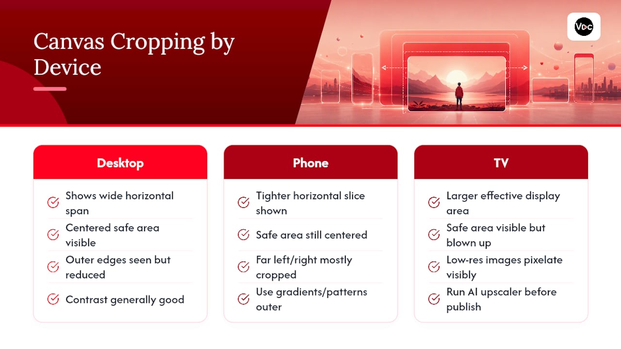
TV displays introduce the opposite problem. Because TVs often render at higher effective resolution and larger physical size, low-quality source images that looked fine on a laptop screen can show visible pixelation or compression artifacts once blown up. This is where an AI upscaler earns its place in your workflow: run any image smaller than your target canvas through an upscaler and check it on the largest display you have access to before publishing.
Contrast is another resolution-dependent issue. Text that reads clearly on a bright desktop monitor can lose legibility on a dimmer phone screen or a TV set to a warmer color temperature. Test your headline against the actual background at full opacity, not just against a placeholder gray box in your editor, and bump contrast higher than feels necessary in your design tool. What looks slightly aggressive in Photoshop often reads as merely “clear” once it’s compressed and displayed on a real device.
If you run campaigns or seasonal promotions, build separate banner files sized identically but with adjusted contrast and padding for each platform context rather than assuming one file serves every screen equally well.
What Are YouTube’s Rules For Channel Banners?
YouTube’s channel branding policy treats your banner the same way it treats any uploaded content: it has to comply with the platform’s Community Guidelines. That means no graphic violence, no sexually explicit imagery, no hate speech or symbols, and no content that harasses or targets individuals or groups.
Copyright is the rule creators trip over most often. Using a stock photo, a screenshot from a film, or fan art you didn’t create or license for your banner can trigger a copyright claim or a takedown, even though it’s just a background image and not a video. If you’re using AI-generated imagery or a template from a third-party site, check the licensing terms before you build your entire banner around it, because swapping a background image after you’ve already promoted the channel look is more work than checking first.
Misleading content is the other flagged category. A banner that implies a partnership, sponsorship, or affiliation you don’t actually have (a brand logo you don’t have permission to use, for instance) can violate YouTube’s policies on deceptive practices even if the rest of your channel is compliant.
The safest approach is straightforward: use imagery you created, licensed, or generated yourself, keep any brand or logo usage limited to your own channel identity, and avoid anything that could be read as impersonating another creator or company. None of this is unique to banners, but banners are the one piece of channel branding people forget falls under the same rules as video content.
How Do You Make Your Banner Message Actually Land?
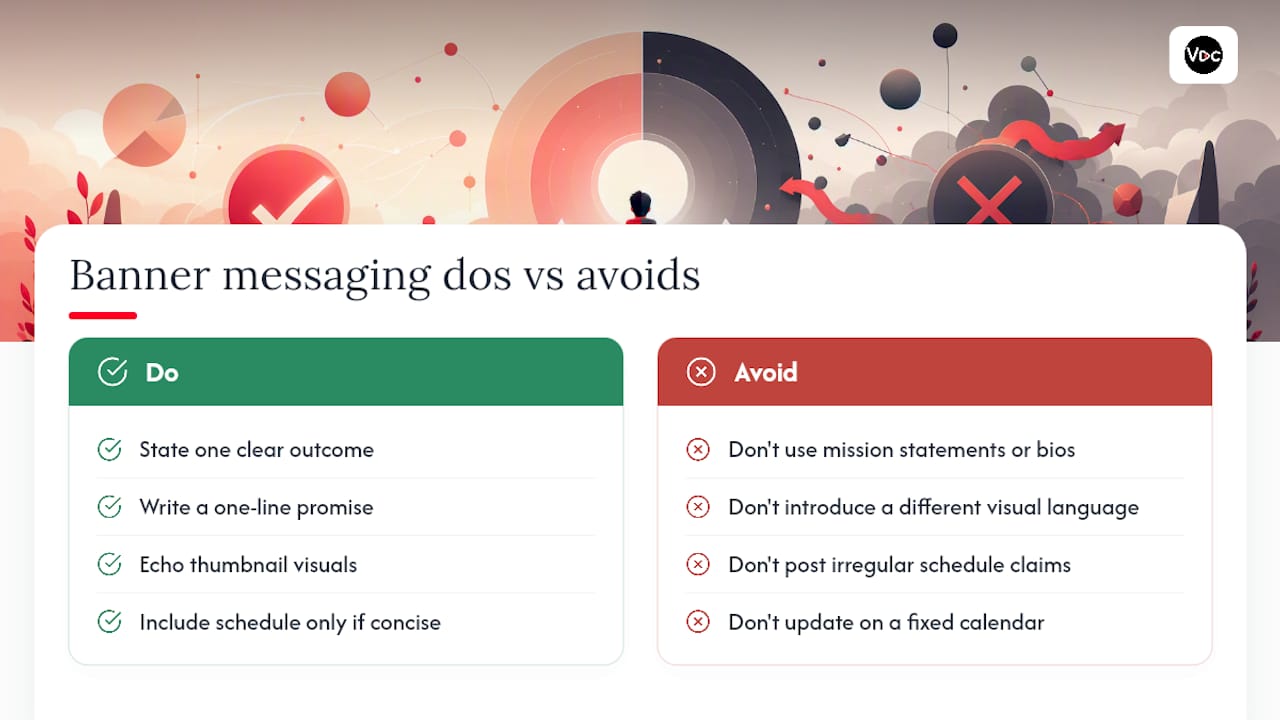
A banner’s job is narrower than most creators treat it. It’s not a mission statement or a full bio, it’s a five-second pitch that either confirms a new visitor is in the right place or gives them a reason to subscribe.
Start with the single outcome you want a first-time viewer to walk away understanding. If your channel teaches Excel formulas, your banner’s job is to say that in as few words as possible, not to describe your teaching philosophy. Adobe Express’s core recommendation, a clear one-line promise paired with visual consistency against your thumbnails, works because it removes ambiguity at the exact moment someone is deciding whether to click subscribe.
Consistency does more work than most creators expect. If your thumbnails use a specific accent color, bold sans-serif type, or a recurring visual motif, your banner should echo it rather than introduce a completely different visual language. Viewers build pattern recognition across your channel without consciously analyzing it, and a banner that looks like it belongs to a different channel than your thumbnails creates a small, subconscious friction every time.
Upload cadence and schedule information belong on the banner only if you can state them in a handful of words (“New videos Tue/Fri”). If your posting schedule is irregular, skip that line entirely rather than putting outdated information in a spot every visitor sees. A stale schedule claim erodes trust faster than having no schedule mentioned at all.
Update the banner when your content focus shifts meaningfully, not on a fixed calendar. A banner that still promotes a series you finished six months ago actively works against you.
The Real Bottleneck In Channel Banner Design
Most banner advice fixates on the aesthetics, color theory, font pairing, composition tricks, and skips past the part that actually determines whether a banner works: consistency over time. A great banner designed once and never touched again slowly drifts out of sync with a channel’s thumbnails, upload schedule, and content focus. That drift is more damaging than a mediocre design that stays current.
The conventional advice treats a banner as a one-time setup task. I’d argue it’s closer to a living asset that needs the same iteration cycle as your thumbnails, updated for campaigns, seasonal pushes, and shifts in content focus, then checked again on real devices every time. Creators who treat banner design as “set it and forget it” are the ones whose channel branding feels stale even when their video content is strong.
For faceless creators specifically, the banner carries more brand weight than it does for face-forward channels, since there’s no recurring personality to anchor recognition. Typography, color consistency, and pattern choices have to do that job instead. That’s precisely where a tool like Voclify’s Brand Studio earns its place: generating banner and logo drafts that stay visually locked to your existing thumbnail style, so refreshing a banner for a new campaign doesn’t mean starting your brand identity from zero each time.
— Arnas
Try Voclify’s Brand Studio For Faster Banner Consistency
Some platforms exist to reduce the friction of rebuilding banners from scratch every time your schedule or campaign changes by generating logo and banner drafts that stay visually consistent with your existing thumbnail style, allowing a new seasonal variant to be created quickly.
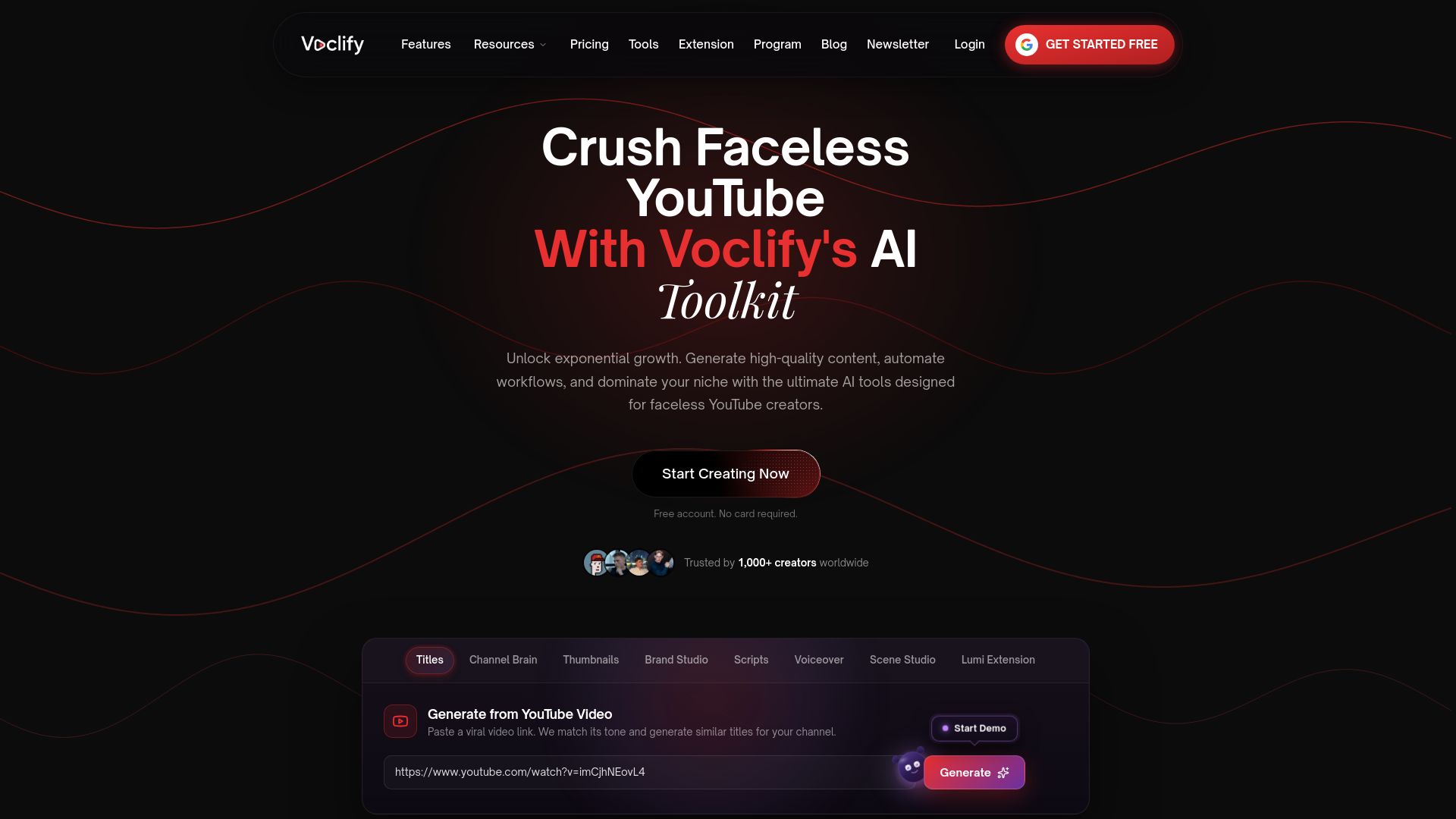
Voclify’s broader toolkit was built for creators running faceless channels who need consistent branding without a design background. Beyond Brand Studio, the platform includes a thumbnail generator that pulls from real proven styles, so your banner and thumbnails stay visually aligned without manual color matching every time you publish. Pair that with a content calendar approach and you can plan banner refreshes around campaigns instead of scrambling to update them after the fact.
Head to Voclify’s tools page to see the full suite, or start with Brand Studio directly if a banner refresh is the immediate priority.
Sources
FAQ
How do I create a channel banner?
Design a 2560×1440 px image, keep your headline and logo inside the centered 1546×423 px safe area, and export it as a PNG or JPEG under 6 MB before uploading it through YouTube Studio’s Customization tab.
What is the best banner design for a YouTube channel?
The best banner pairs a clear one-line promise with visual style that matches your thumbnails, whether that’s a value-focused layout, a brand-centric logo layout, or a face-forward portrait layout depending on your content type.
What are the dimensions of a channel banner?
YouTube’s recommended banner size is 2560×1440 px, with a minimum acceptable upload of 2048×1152 px, and the safe area that displays reliably across devices measures 1546×423 px, centered on the canvas.
How can I create a banner for my YouTube channel?
Use a template editor with a locked safe-area guide layer, write a 7 to 12-word headline, choose imagery that echoes your thumbnails, and export as PNG or JPEG under 6 MB. Tools like Voclify’s Brand Studio can generate banner drafts that already respect the safe area, which speeds up the process for creators managing multiple channel variants.
Recommended

Get more of this in your Google results
Add voclify.io as a preferred source and Google shows you more of our articles in Search and AI Mode.