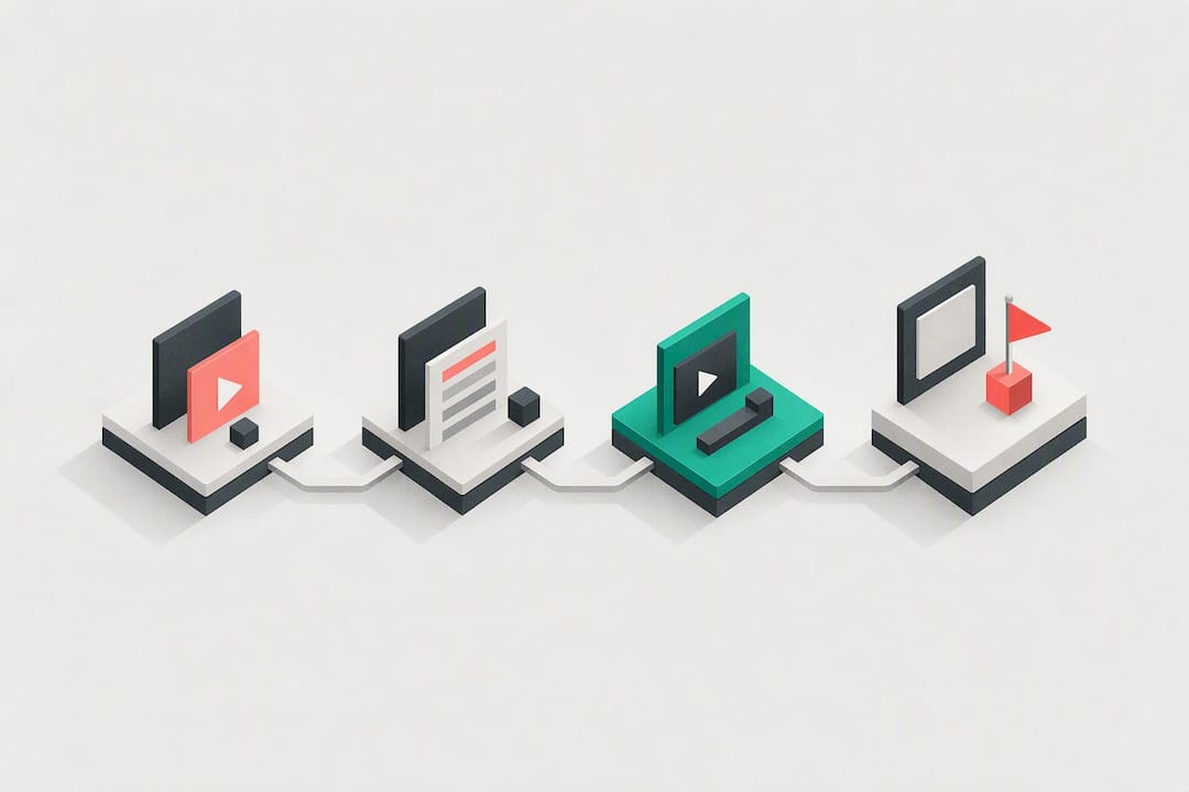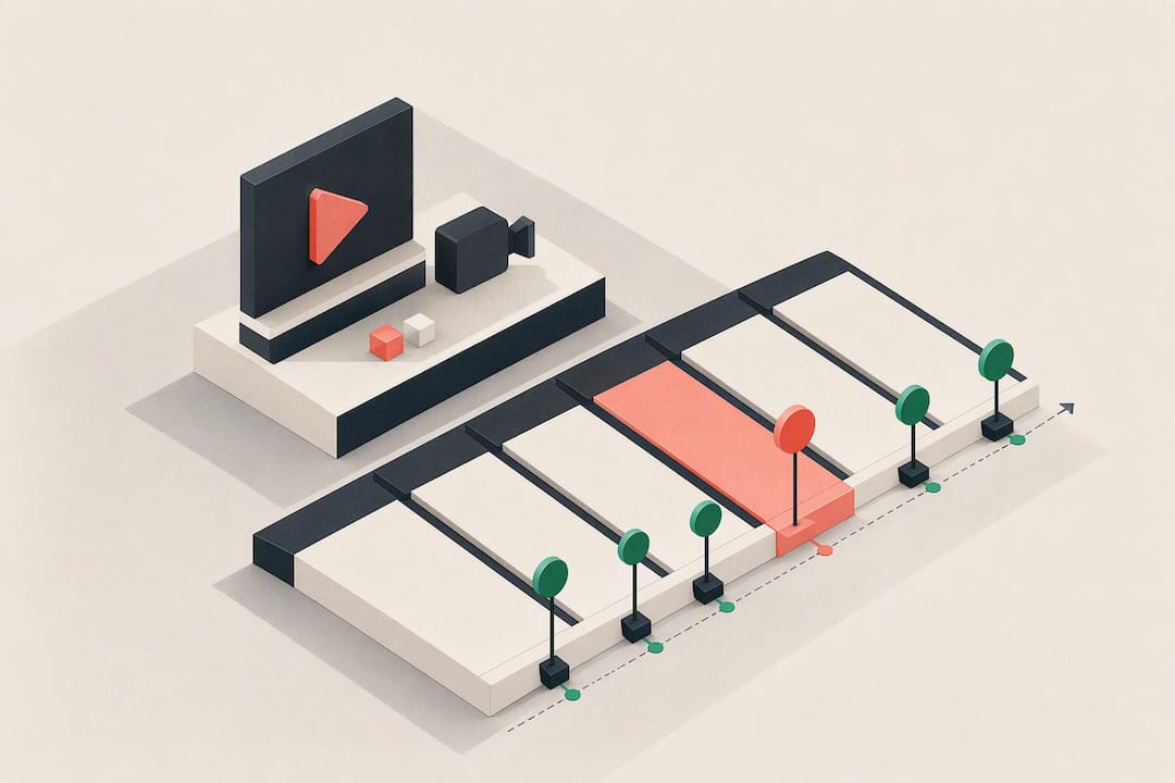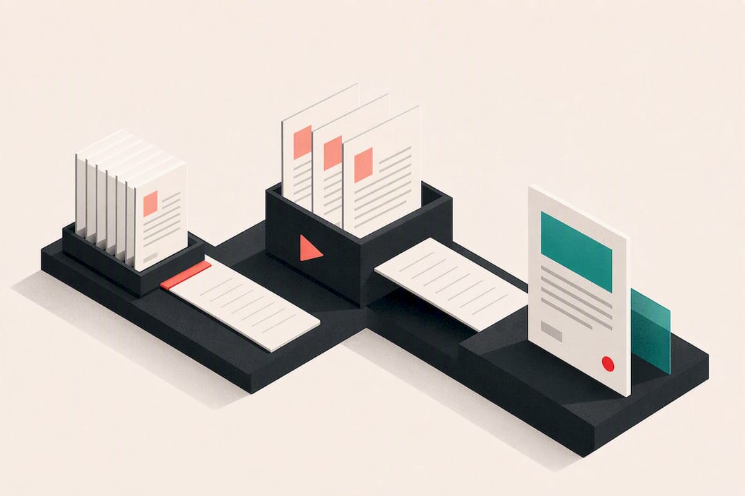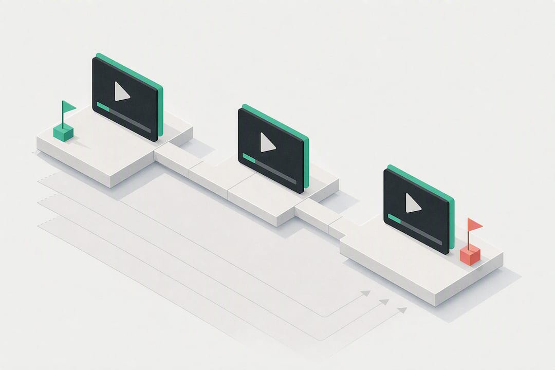
The best YouTube CTA pattern isn’t a laundry list of asks. It’s value first, then one primary CTA delivered as a stack: a spoken line, an on-screen prompt, and a clickable path (card, end screen, or description link) all pointing the same direction. Try something like “If this saved you time, subscribe for a new one every Tuesday” paired with a matching end-screen card. Below, you’ll find copyable scripts, timing windows, and the metrics that tell you if it’s working.
TL;DR:
- CTAs should be delivered as a stack with consistent verbal, visual, and clickable elements to ensure all viewers receive the message regardless of how they watch.
- Placing primary CTAs after delivering a genuine payoff or insight increases their effectiveness and prevents viewers from dropping off early.
- Testing phrasing, timing, and format over multiple videos reveals what works best for your audience, with visual and verbal cues outperforming either alone.
- Avoid overwhelming viewers with too many competing asks, and always ensure on-screen links are visible, clear, and match the verbal message.
- Using benefit-led, concrete prompts tied to specific actions typically yields higher engagement than generic or purely direct CTAs.
What Is a YouTube CTA (And the Formats Worth Using)
A call to action, or CTA, is the specific instruction you give viewers about what to do next: subscribe, click, comment, buy. On YouTube, that instruction can show up in six different places, and each one carries a different job.
Verbal CTAs are the spoken ask, delivered mid-sentence or as a direct aside to camera. On-screen text or graphics reinforce that same message visually, which matters because a large share of viewers watch muted. Cards are the clickable pop-ups that appear during playback, best used at a natural transition rather than jammed into the intro. End screens are your last 5 to 20 seconds of real estate, built for subscribe prompts and next-video suggestions. Description links live in the text block under the video, and only the first one or two lines get seen without a click on “show more.” Pinned comments and community posts extend the ask past the video itself, and a membership CTA works best when it’s tied to a specific, tangible perk rather than a generic “join my channel” line.
Here’s how those formats map to common creator goals:
- Subscriber growth: verbal + end screen, placed after a payoff moment
- Retention/watch next: cards and end screens pointing to a related video
- Engagement (likes, comments): verbal CTA dropped mid-video, right after a strong point
- Traffic or lead generation: description link plus a pinned comment as backup
- Membership or Patreon asks: end screen and pinned comment, tied to a specific perk
Common categories creators lean on include subscribe/bell prompts, watch-next suggestions, and pinned comment links, which cover most of what a channel actually needs.
Copyable YouTube CTA Examples by Goal
Here’s a working bank of lines organized by what you’re trying to accomplish. Each one comes with a direct version, a benefit-led version, and a short on-screen overlay you can drop into your editing software.
1. Subscriber growth
- Direct: “Subscribe if you want more videos like this.”
- Benefit-led: “Subscribe and I’ll send you a new [topic] breakdown every week, no fluff.”
- Overlay text: “New videos every Tuesday →”
- Placement: end screen, or verbally right after your strongest point lands.
2. Watch-next / retention
- Direct: “Watch this next video for the full walkthrough.”
- Benefit-led: “If this part confused you, the next video clears it up in under 5 minutes.”
- Overlay text: “Watch this next ↗”
- Placement: mid-video card at a natural pause, reinforced on the end screen.
3. Engagement (comments, likes)
- Direct: “Drop a comment with your answer.”
- Benefit-led: “Comment your setup below. I read every one and reply with feedback.”
- Overlay text: “Tell me in the comments”
- Placement: right after you pose a question or controversial claim, not at the very end when attention has already dropped.
4. Traffic / external link
- Direct: “Link’s in the description.”
- Benefit-led: “Grab the free template in the first line of the description. It’s the exact one I used here.”
- Overlay text: “Free template ↓ description”
- Placement: mention it once early as a soft tease, then again with the full instruction at 70 to 80% through the video.
5. Leads (email list, freebie)
- Direct: “Sign up using the link below.”
- Benefit-led: “I turned this into a checklist. It’s free, linked below, and takes two minutes to grab.”
- Overlay text: “Free checklist below”
- Placement: after you’ve delivered the core value, never in the first 30 seconds.
6. Membership / Patreon
- Direct: “Join the channel for extra perks.”
- Benefit-led: “Members get the raw project files from every video. Link’s on the end screen if that’s useful to you.”
- Overlay text: “Members get raw files →”
- Placement: end screen or pinned comment, tied to something concrete.
7. FOMO / urgency
- Direct: “This offer ends Friday.”
- Benefit-led: “I’m only keeping this discount live through Friday because the price goes up after that.”
- Overlay text: “Ends Friday”
- Placement: mid-video once, then repeated in the final CTA.
A quick rule for choosing tone: use the direct version when your audience already trusts you and just needs a nudge. Use the benefit-led version when you’re asking for something new, like a first-time subscribe or an email signup, because it answers the unspoken “why should I” before the viewer asks it. Wyzowl’s collection of video CTA examples is a good source for more phrasing inspiration if you want to build your own swipe file.
When to Place Your CTA (Timing Beats Wording)
Timing determines whether anyone hears your CTA at all. Roughly 40% of viewers drop off from videos between two and three minutes long, which means an ask placed in the first 60 seconds is often talking to an audience that’s already thinning out.
The fix is the value-first rule: deliver a real insight, tip, or payoff before you ask for anything. Save your primary, stacked CTA for after that moment, not before it.
Practical windows that work:
- 0 to 15 seconds: a soft, single-line mention (“Stick around, I’ll show you the setup that fixed this”). No hard ask yet.
- Mid-video, right after your best point: “If that just saved you a headache, hit subscribe. I post one of these a week.”
- 70 to 80% through: the external or watch-next prompt. “If you want the full template, it’s linked below.”
- Final 15 seconds: your one primary CTA, spoken and shown, matched to the end screen.
For most videos under 10 minutes, two to three CTAs is the ceiling. Longer content can support four or five if they’re spaced out, but every video still needs exactly one primary objective. Layering five different asks with equal weight just confuses the algorithm and the viewer about what actually matters.
The CTA Stack: Getting Verbal, Visual, and Clickable Elements to Agree
A “CTA stack” is when your spoken line, your on-screen text, and your clickable element (card, end screen, or description link) all say the same thing at the same moment. When they line up, viewers watching with sound and viewers watching muted both get the message. When they don’t, you lose half your audience to confusion.
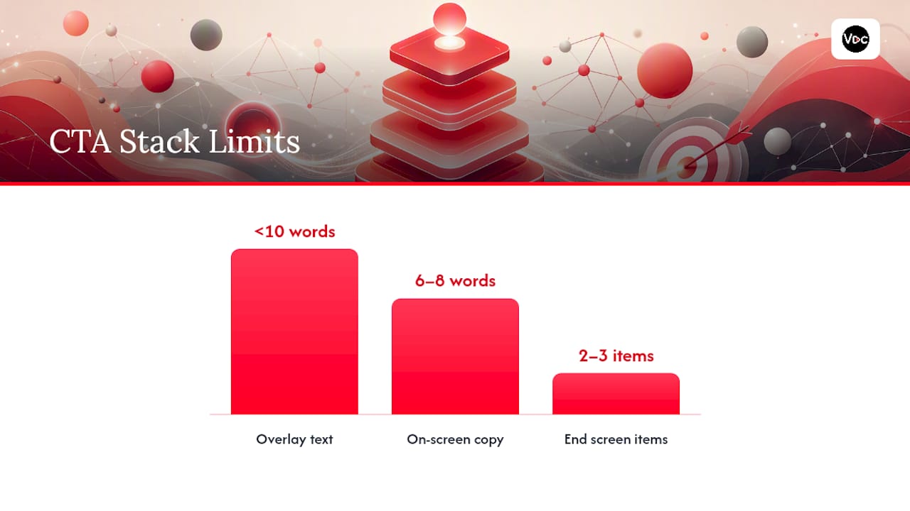
A working stacked example looks like this: you say “Grab the checklist, it’s linked first in the description,” while an overlay reads “Free checklist ↓” and a card appears in the corner pointing to the exact same link. That alignment across formats is what keeps the message consistent no matter how someone is watching.
A few design rules for the on-screen piece:
- Keep overlay text under 10 words. Anything longer gets skipped.
- Use high contrast (light text on a dark box, or vice versa), never thin text over a busy background.
- Size it for mobile. If you can’t read it on a phone screen at arm’s length, it’s too small.
- End screens should carry only 2 to 3 elements, and each one needs to actually relate to the video the viewer just watched.
Pro Tip: Pre-write your verbal CTA line first, then build your on-screen overlay from the same six to eight words. Writing them separately is how you end up with a stack that technically works but reads like two different videos talking over each other.
Reusable CTA Scripts You Can Adapt in Minutes
Most strong CTAs follow one formula: value reminder + future promise + specific action. (“If this fixed your problem, subscribe for a new fix every week.”) Swap the middle clause and you’ve got a template for nearly any video type.
- Tutorial: “If that walkthrough saved you time, subscribe. I break down one tool like this every week.”
- Review: “If this review helped you decide, drop a like so I know to keep doing full breakdowns.”
- Series teaser: “Part two goes up Thursday and covers the part everyone asks about. Subscribe so you don’t miss it.”
- Shorts handoff: “Full version with the details is on the channel. Tap my profile to watch it.”
- Membership ask: “Members got this three days early. If that’s useful, the link’s on the end screen.”
- Lead magnet: “I turned this into a free download. First link in the description, no email spam.”
- Comment prompt: “Which method would you try first? Tell me below, I’m reading every comment on this one.”
- Traffic to another platform: “Full behind-the-scenes is on [platform]. Link’s pinned in the comments.”
Test a short version against a longer version of the same script on similar videos. Shorter usually wins on retention-sensitive spots like the intro; longer, benefit-led versions tend to win right after a payoff moment where viewers have more patience.
How to Measure Whether Your CTAs Are Working
Track four things: card and end-screen click-through rate, description link click rate, downstream conversions (actual signups or sales, not just clicks), and comment rate right after an engagement CTA. Subscriber lift after a variant run is the slower but more telling number.
Run simple A/B tests instead of guessing:
- Test phrasing: direct vs. benefit-led, same placement, similar videos.
- Test timing: mid-video ask vs. end-only ask.
- Test format: visual-only overlay vs. verbal-plus-visual.
Give each test at least 5 to 10 videos before drawing conclusions. Fewer than that, and normal variance in topic and thumbnail performance will drown out the CTA effect. Combined visual and verbal approaches tend to outperform either one alone, often by a double-digit percentage, so if your test shows a clear winner, roll it out channel-wide rather than re-testing it on every new upload.
Common CTA Mistakes and a Pre-Publish Checklist
The most frequent failure isn’t bad wording. It’s too many competing asks. A video that pushes subscribe, a giveaway, a sponsor link, and a comment prompt all with equal weight leaves viewers doing nothing.
Mistakes to watch for:
- Too many CTAs with no clear priority: pick one primary objective per video.
- Mixed messages across the stack: verbal says one thing, overlay says another.
- On-screen text too small to read on mobile.
- Link buried past the “show more” fold in the description.
| Checklist item | Why it matters |
|---|---|
| One primary CTA chosen | Prevents diluted, confusing asks |
| Verbal, overlay, and card all match | Keeps message consistent muted or not |
| Link in first two lines of description | Visible without a click to expand |
| End screen updated with relevant video/link | Matches viewer intent at video’s end |
| Tracking link added for measurement | Lets you read click-through data later |
What Most Creators Get Backwards About CTAs
Most creators treat the CTA as an afterthought bolted onto the outro, and it shows: generic, rushed, disconnected from what the video just delivered. I’ve seen a single change, swapping “subscribe if you liked this” for a benefit-led line tied to a specific upload schedule, produce a visible bump in subscriber conversion on an otherwise identical video. The wording mattered less than the fact that it named a concrete reason to say yes.
If you want a fast experiment, run this for 7 to 14 days: keep your video content identical, but alternate a direct CTA and a benefit-led CTA across your next four uploads, then compare end-screen click-through. The gap will tell you more about your specific audience than any general benchmark can, including the ones referenced in this piece. Check your channel’s engagement benchmarks against your own numbers before assuming a tactic that works for someone else will work for you.
— Arnas
Let Voclify Handle the CTA Grunt Work
Writing a fresh, benefit-led CTA stack for every upload gets old fast, especially when you’re also handling titles, thumbnails, and voiceover on top of it. Voclify’s script generator builds CTA variants alongside your video script, so the verbal line, the description’s first sentence, and the on-screen overlay text come out matched instead of written separately at 11 p.m. before a deadline.
Pair that with the thumbnail generator for overlay-ready text and the AI voiceover tool if you’re running a faceless channel, and a full stacked CTA bundle, verbal line, overlay copy, and description opener, comes together in minutes instead of a full editing session. Start a project on Voclify and build your next CTA stack before your next upload goes out.
Sources
- HubSpot — Video CTA guidance (YouTube CTAs)
- MarTech — The science behind high-performing calls-to-action
- InstantViews — YouTube call-to-action strategies (2026)
Recommended

Get more of this in your Google results
Add voclify.io as a preferred source and Google shows you more of our articles in Search and AI Mode.