A YouTube style guide is a documented system of reusable rules and templates covering thumbnails, script voice, metadata, and upload specs that lets faceless creators produce consistent, on-brand videos without reinventing decisions every episode. The essential pieces are a visual kit (banner, palette, thumbnail templates), a voice and script standard, metadata formulas, and a repeatable production workflow. Get those four documented, and output speeds up while quality holds steady.
TL;DR:
- Creating 3 to 5 reusable thumbnail templates centered around a limited color palette and a single dominant font boosts recognition and consistency among top-performing videos.
- Scripts should start with a strong, immediate payoff or problem statement within the first 5 to 10 seconds to maximize viewer retention and avoid slow warm-up intros.
- A thorough workflow breakdown—brief, create, review, publish—reduces production time and helps maintain style consistency across multiple team members or contractors.
- Regularly updating and auditing the style guide, including thumbnail A/B tests and viewer feedback, ensures branding remains current and accurate to channel standards.
- AI tools like Voclify enable automatic enforcement of visual templates, voice tone, and workflow steps, making consistent channel branding scalable beyond a solo creator.
What Belongs in Your YouTube Style Guide’s Brand Kit?
Your brand kit is the visual backbone of the guide, and it starts with specs, not inspiration. YouTube’s own guidance recommends uploading a banner at 2560 x 1440 pixels and keeping every logo, headline, and piece of critical text inside the central safe area, since the same banner gets cropped differently on a phone, a desktop browser, and a smart TV. Your profile image needs the same treatment: nothing important near the edges, because circular cropping on mobile eats the corners first.
Thumbnails matter more than any other single asset. Branding consultants recommend building 3 to 5 reusable thumbnail templates built around a three-color palette and one dominant headline font, so a viewer scrolling their feed recognizes your video before they’ve even read the title.
Pro Tip: Print your thumbnail at the size it actually appears in a mobile feed (roughly 120 by 68 pixels) before you approve it. Text that looks clean at full resolution often turns to mush at that scale.
Document these rules in the guide itself:
- Palette: Three hex codes maximum, one for background, one for accent, one for text.
- Typography: Two fonts total. One bold sans-serif for thumbnail text (3 to 5 words max), one for lower thirds and titles.
- Thumbnail treatment: A fixed rule for photo filters, crop ratio, and where the text block sits (top-left or bottom-third, not both).
- Audio branding: A 3 to 5 second sonic logo at the intro, plus a fixed loudness target so episodes don’t jump in volume.
- Metadata formula: Title structure of hook plus keyword plus series tag, a description template with the same first two lines every time, and standardized caption formatting.
Custom, on-brand thumbnails show up disproportionately among top-performing videos, which is the entire argument for locking these rules down early rather than improvising them per upload.
How Should Faceless Creators Standardize Script Voice?
Voiceover carries your entire brand personality when there’s no face on screen, so script rules need to be explicit enough that any writer or AI tool produces something that sounds like your channel.
Start with the hook. The first 5 to 10 seconds should state the payoff or the problem, never a warm-up sentence like “Hey everyone, welcome back.” Faceless viewers skip intros ruthlessly, and a slow hook is the single fastest way to tank retention.
From there, apply these standards to every script:
- Sentence length: Cap most sentences at 15 to 18 words when read aloud. Long clauses get lost in voiceover in a way they don’t on a page.
- Vocabulary guardrails: Ban jargon your average viewer wouldn’t say out loud; keep a short list of approved or banned terms per channel.
- CTA placement: One soft CTA around the 40% mark (“stick around, this gets better”), one hard CTA in the final 15 seconds (“subscribe if this helped, next video is linked below”).
- Captioning: Standard SRT formatting, two lines maximum per caption, speaker labels only when multiple voices appear.
Two templates make this concrete: a Shorts script (hook, 3 quick beats, CTA, all under 45 seconds of spoken word) and a long-form script (cold open hook, context, 3 to 4 body sections, recap, CTA) sized for an 8 to 12 minute runtime.
Pro Tip: Read every script aloud before recording. If you stumble on a sentence, a voiceover engine will stumble on it too.
How Do You Build a Repeatable Production Workflow?
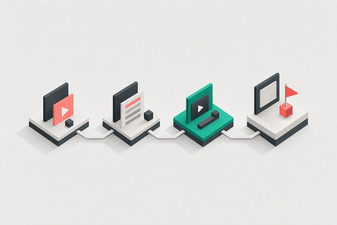
A style guide only earns its keep when it’s built into an actual workflow, not filed away as a reference document nobody opens. The cleanest structure runs in four stages: brief, create, review, publish.
The brief is a one-line template with fixed fields: title, target audience, hook line, thumbnail direction, target length, and CTA. Any editor or contractor should be able to fill this out in under five minutes and hand it to production.
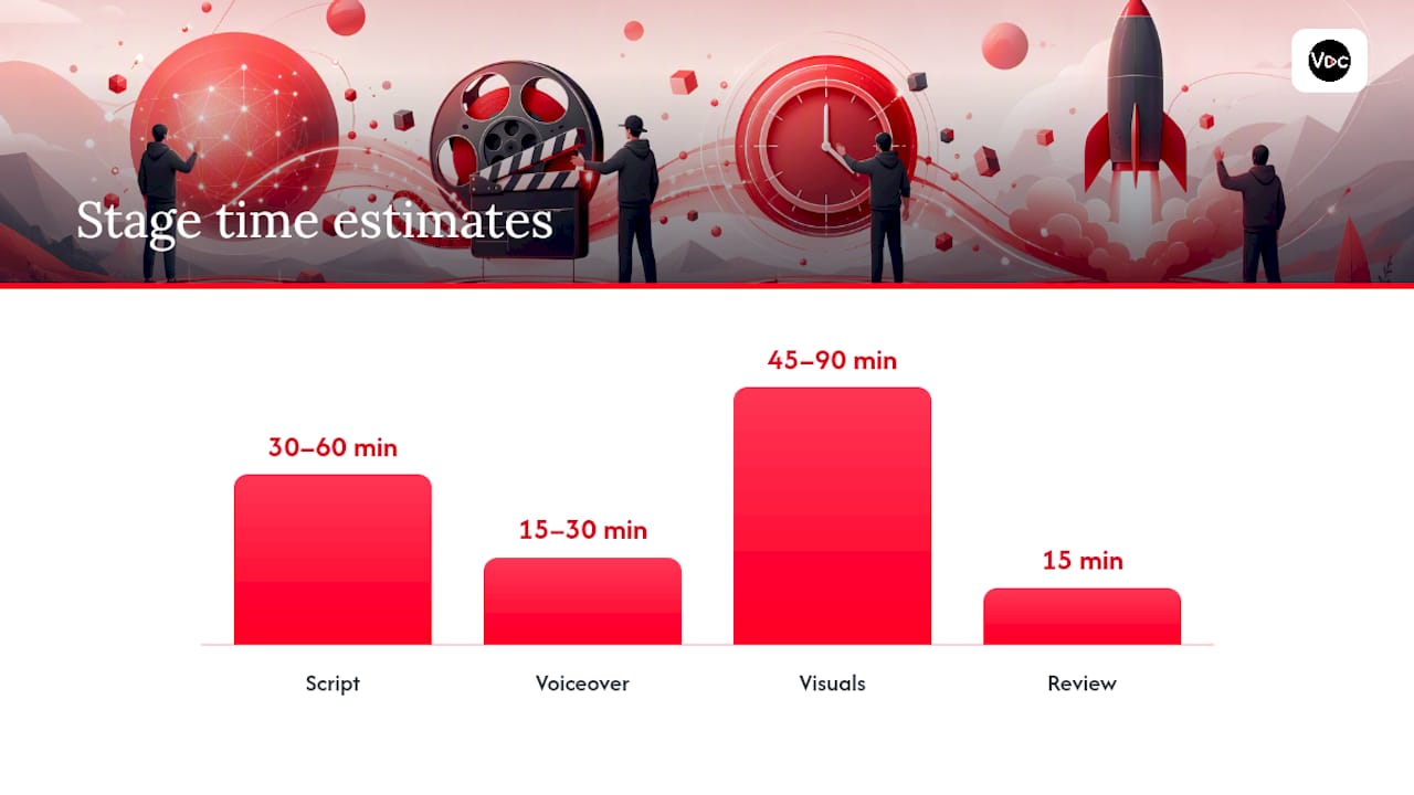
Task breakdown typically looks like this:
- Script: Writer or AI tool drafts against the brief (30 to 60 minutes).
- Voiceover: Recorded or generated once the script is locked (15 to 30 minutes).
- Visuals: Scene assembly and thumbnail creation using approved templates (45 to 90 minutes).
- Review: A second person checks against the style guide, not just for typos (15 minutes).
Thumbnail review deserves its own checkpoint: swap the template’s headline text and photo, then check contrast and legibility at feed size before moving on.
Before upload, run this checklist every time:
- Export resolution and container match your channel standard (1080p minimum, MP4).
- Caption file (SRT) is attached and proofread.
- Thumbnail meets the exact pixel size your template specifies.
- Metadata fields (title, description, tags) follow the documented formula.
- End screen, watermark, and scheduled publish time are all set before you hit publish.
How Do You Keep the Style Guide From Going Stale?
A style guide that lives in someone’s memory instead of a shared document dies the moment that person takes a week off. Store it in one cloud doc with version numbers in the file name (v1.2, v1.3) so editors always know which copy is current, and name one person as the owner who approves changes.
New editors and contractors should get a short onboarding pass before they touch a real video:
- Walk through the full guide once, live, not just a link dump.
- Have them build one thumbnail and one script against a past brief as a test run.
- Review that test against the guide before they touch a real upload.
Run a brand audit monthly for a young channel, quarterly once things stabilize. Track thumbnail click-through rate and average view duration against your own baseline, since consistent branding tends to support both CTR and subscriber conversion when the content underneath is already solid.
Pro Tip: Run controlled thumbnail A/B tests one variable at a time (just the color, just the text) using YouTube’s built-in testing feature. Changing three things at once tells you nothing about which one worked.
Community tab polls are an underused feedback loop here. Ask viewers to pick between two thumbnail directions before a big upload, and you get real signal instead of a guess.
Why Trust This Approach to Channel Branding?
This piece was reported by Arnas, covering YouTube growth tactics and channel operations for the Voclify blog, with an eye toward what actually holds up once a channel scales past one person doing everything.
Voclify has been used by over 1,000 creators, some of whose channels have collectively pulled in millions of subscribers, and the pattern across those channels is consistent: the ones that scale fastest are the ones that turned their style guide into templates rather than a document nobody rereads.
AI-assisted tools for thumbnails, scripts, and voiceovers don’t replace the guide, they enforce it. When a template generates the palette and font automatically, an editor can’t accidentally drift off-brand, and a five-person contractor team can produce at a volume that would take a solo creator months to match by hand.
Visual Elements Beyond Thumbnails and Banners
Thumbnails and banners get most of the attention, but the visual system that holds a video together lives in the details viewers see for a fraction of a second, over and over.
Lower thirds are worth standardizing first. If your channel names a source, a stat, or a location on screen, use the same box shape, font, and animation duration every time, so a returning viewer recognizes the pattern before they even read the text. A 0.3 to 0.5 second slide-in is typically fast enough to feel intentional without dragging the pace down.
Transitions deserve the same restraint. Pick one or two transition types (a hard cut and a quick whip pan, for example) and use them everywhere. Randomly switching between a dozen transition effects across episodes reads as unpolished, even when the underlying content is strong.
Animated text callouts, progress bars, and chapter markers should follow the same color and font rules as your thumbnails. This is where a lot of faceless channels quietly break their own brand: the thumbnail looks sharp and on-brand, then the in-video graphics use a completely different font because they were built in a rush. Document your animation style (motion direction, timing, easing) once, and reuse it as a template layer rather than rebuilding it per video.
Standard Guidelines for Video Pacing and Length
Pacing rules belong in the style guide because they’re a brand decision, not just an editing preference. A channel that cuts every 2 seconds trains a different kind of viewer than one that holds a shot for 8.
For long-form videos, a workable default is a new visual beat (b-roll change, graphic, angle shift) every 4 to 8 seconds during explanation-heavy sections, tightening to 2 to 4 seconds during high-energy or list-style segments. Static visuals held longer than 10 seconds tend to bleed viewers unless the voiceover itself is carrying real tension.
Length should follow the format, not a fixed number. Shorts perform best under 45 to 60 seconds when the hook lands in the first 3 seconds. Long-form explainer content in the 8 to 12 minute range tends to balance watch time against drop-off for most faceless niches, though a genuinely dense topic can justify running longer if every section earns its place.
Write your pacing rule down as a range, not a rigid number, and have editors flag any cut that breaks the pattern for review before publish. Consistency in pacing is what makes a channel feel produced rather than assembled.
Thumbnail Accessibility: Text Readability and Color Contrast
A thumbnail that looks great on your monitor can be unreadable on the small screen most viewers actually use to browse, which makes accessibility a practical concern, not just an ethical one.
Contrast is the first fix. Light text on a dark background (or the reverse) reads faster than mid-tone combinations, and a thin drop shadow or outline around thumbnail text keeps it legible even against busy photo backgrounds. Avoid placing text directly over a photo’s busiest area; a solid or semi-transparent color block behind the text solves this instantly.
Text size matters more than most creators assume. Branding guidance recommends bold sans-serif fonts capped at 3 to 5 words, and that limit exists partly because shorter text can render larger, which helps viewers with low vision or anyone browsing on a small phone screen in bright light.
Color choices should never rely on hue alone to convey meaning (a red versus green indicator, for example) since color-blind viewers won’t catch the distinction. Pair color with shape, icon, or text label instead. Preview every thumbnail in grayscale as a quick contrast check. If it’s still readable in black and white, the color contrast is doing its job.

Why Templates Beat Talent for Faceless Channel Consistency
The conventional advice on YouTube branding treats style as a creative exercise: find your aesthetic, develop your voice, let it evolve naturally. That works for a solo creator building a personal brand around their own face. It falls apart the moment a second editor, a contractor, or an AI tool enters the workflow, because “developed naturally” isn’t something you can hand off.
What actually works is treating the style guide as an operational document from day one, not a branding afterthought written after the channel already has traction. The channels that scale fastest document their thumbnail formula, their script structure, and their upload checklist before they need a second person, so onboarding a contractor takes an afternoon instead of a month of trial and error.
The biggest mistake I see is overinvesting in the visual kit while leaving voice and workflow undocumented. A gorgeous thumbnail template means nothing if every script sounds like a different person wrote it. Start with the workflow and the voice rules. The visuals are easier to template once those are locked.
— Arnas
Put the Style Guide to Work With Voclify
Documenting a style guide is one thing. Executing it consistently, episode after episode, with a small team or a rotating cast of contractors, is where most channels lose the thread. That’s exactly where Voclify fits: it turns your written rules into reusable tools instead of a checklist someone has to remember.
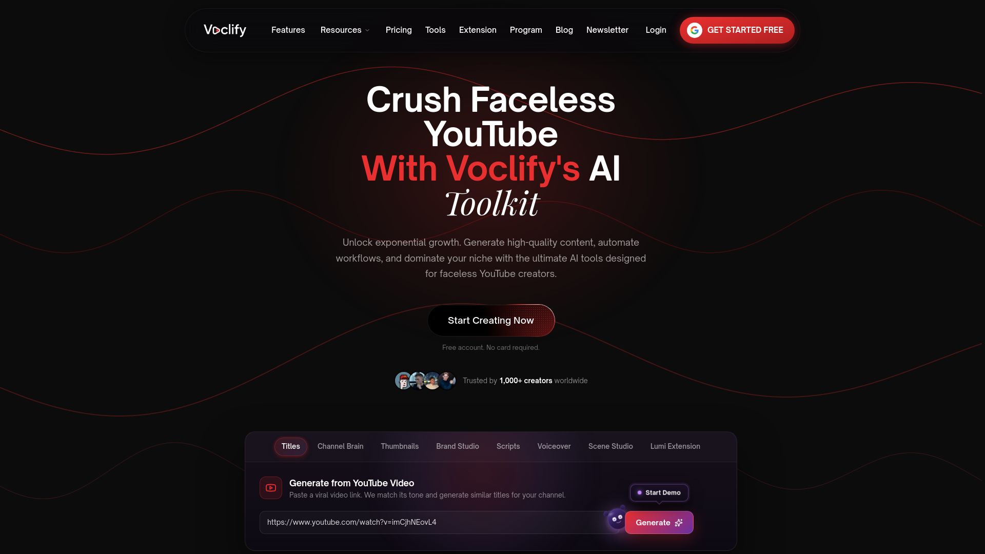
The thumbnail generator works directly from templates styled to match your existing brand, so an editor doesn’t need design skills to hit the palette and font rules you’ve already set. The AI voiceover tool keeps tone and pacing consistent across scripts written by different people, and the scene studio generates on-brand visuals for faceless episodes without a reshoot every time.
If you’re evaluating any AI toolkit against your own style guide, check three things before committing: export formats that match your editing software, clear ownership of anything you generate, and real integration with the workflow steps you already run. Voclify’s browser extension is free to try, and the full toolkit is available for creators ready to standardize production. Explore the tools and see which piece fits your current bottleneck first.
Sources
For exact dimensions, confirm banner and profile image specs directly on YouTube’s own channel art guidance. For deeper thumbnail and template strategy, the Alan Spicer branding guide and the Monitor YT branding overview both cover template systems in more detail. For downloadable brand assets, Voclify’s Brand Studio tool generates logos and banners directly from your palette rules.
- Channel banner & profile picture tips - YouTube Help
- YouTube Channel Branding: Logo, Banner, and Visual Identity That Gets Subscribers - Alan Spicer
- YouTube Channel Branding Guide | Monitor YT
FAQ
What Is a YouTube Style Guide?
It’s a documented set of rules and templates covering thumbnails, banners, script voice, metadata, and upload specs that keeps a channel’s videos consistent, especially useful for faceless channels run by more than one person.
What Size Should My YouTube Banner Be?
YouTube recommends uploading your banner at 2560 x 1440 pixels and keeping all critical text and logos inside the central safe area to avoid cropping across devices.
How Many Thumbnail Templates Do I Need?
Most branding guidance recommends 3 to 5 reusable thumbnail templates built around a fixed three-color palette and a single headline font.
How Long Should a Video Hook Be?
For both Shorts and long-form videos, the hook should land in the first 5 to 10 seconds and state the payoff or problem immediately, without a slow greeting or warm-up.
Can AI Tools Help Enforce a Style Guide?
Yes. Tools like Voclify apply your thumbnail templates, script structure, and voiceover tone automatically, which reduces the chance that a contractor or editor accidentally drifts off-brand.
Recommended

Get more of this in your Google results
Add voclify.io as a preferred source and Google shows you more of our articles in Search and AI Mode.