Pick a 3 to 5 color palette built on the 60/30/10 rule and put it on your thumbnails first. Below you’ll find three ready-made palettes (energetic warm, cool and trustworthy, high-contrast standout) with exact hex codes. Grab the one that fits your niche and update your next several thumbnails soon. That single change can move the needle faster than any banner redesign.
TL;DR:
- Ensure your palette remains visually distinct at small sizes by prioritizing contrast over hue, especially for mobile thumbnail displays.
- Test one color variable at a time over two-week periods to accurately measure impact on click-through and viewing metrics before larger redesigns.
- Use only the three core hex codes consistently across all assets, including thumbnails, channel art, and overlays, to maintain brand recognition.
- Avoid pairing colors with similar saturation and brightness to prevent muddiness at tiny sizes, adding outlines or shadows for better readability.
- Focus on proven color schemes—warm, cool, or high-contrast—rather than seeking highly unique palettes, for better recognition and performance.
What Are the Best YouTube Brand Color Palettes to Use?
I’ve watched too many creators pick colors based on what looks nice in a moodboard, then wonder why their channel feels scattered six months later. The fix isn’t complicated. You need a primary color, a secondary color, and an accent, applied consistently across every thumbnail you publish. That’s the whole system.
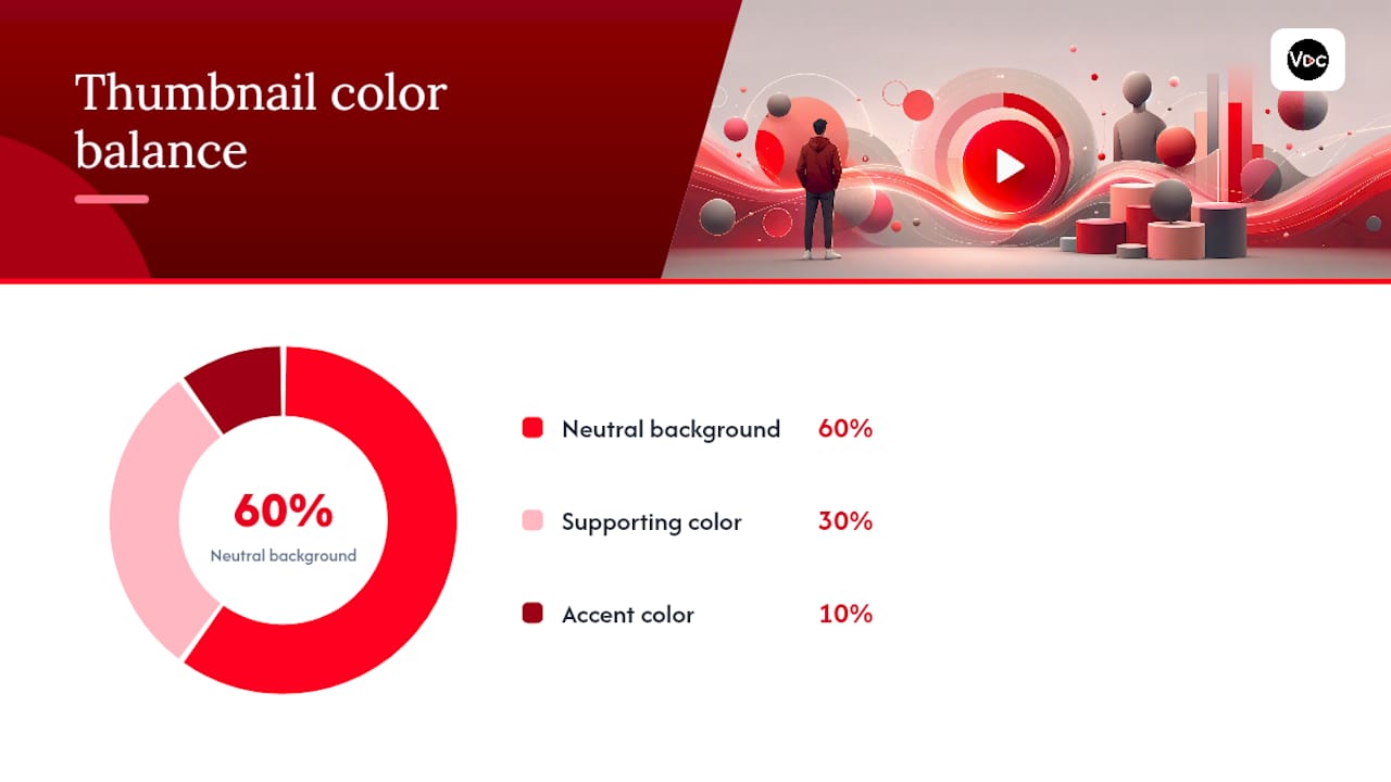
The 60/30/10 rule makes this easy to apply without overthinking it: 60% of your thumbnail is a neutral background or scene treatment, 30% is a supporting color on boxes, banners, or shapes, and the remaining 10% is a high-saturation accent reserved for your title text or a call-out element. This keeps every thumbnail readable at a glance while still looking like it belongs to the same channel.
Here are three palettes built for different content types. Each one includes hex and RGB values you can paste straight into Canva, Photoshop, or the Voclify thumbnail generator.
Palette A: Warm Energetic works for vlogs, motivation, fitness, and lifestyle content. It leans on orange and red tones that read as high energy and urgency.
- Primary:
#FF5A1F(RGB 255, 90, 31) - Secondary:
#2B2B2B(RGB 43, 43, 43) - Accent:
#FFD23F(RGB 255, 210, 63) - Neutral:
#F4F1EC(RGB 244, 241, 236)
Palette B: Cool Trustworthy fits education, tech reviews, finance, and tutorial channels. Blue signals reliability, which matters when viewers are deciding whether to trust your advice.
- Primary:
#1D4E89(RGB 29, 78, 137) - Secondary:
#E8ECF1(RGB 232, 236, 241) - Accent:
#F2A104(RGB 242, 161, 4) - Neutral:
#0D1B2A(RGB 13, 27, 42)
Palette C: High-Contrast Standout is built for gaming, listicles, and quick-hook content where you’re competing against dozens of thumbnails in a fast-scroll feed.
- Primary:
#0A0A0A(RGB 10, 10, 10) - Secondary:
#FFFFFF(RGB 255, 255, 255) - Accent:
#F9E900(RGB 249, 233, 0) - Neutral:
#3A3A3A(RGB 58, 58, 58)
| Palette | Primary Use | Best-Fit Niches |
|---|---|---|
| A: Warm Energetic | Subject highlight boxes, title text | Vlogs, fitness, motivation |
| B: Cool Trustworthy | Backgrounds, lower thirds | Education, finance, tech |
| C: High-Contrast Standout | Text and accent shapes | Gaming, listicles, reaction content |
Yellow on black and white on red are among the highest-visibility combinations tested for thumbnails, which is exactly why Palette C leans on that pairing. Color choices aren’t just aesthetic, either. Blue tends to read as trust, red as energy, yellow as happiness, and green as growth, and that mapping shows up consistently in how viewers judge a channel’s identity before they’ve watched a single second.
Pro Tip: Save your three hex codes in a note on your phone. Every time you open a design tool, paste them in first. Skipping this step is the number one reason channels drift off-brand within a few months.
How Do You Use Brand Colors in Thumbnails Correctly?
A thumbnail that follows your palette but still fails on contrast will lose clicks. Contrast beats hue almost every time. A palette that holds up at 128x72 pixels, the size most thumbnails actually render at in feed, will outperform a “prettier” palette that turns muddy at small sizes.
Here’s the template anatomy I recommend for every faceless channel:
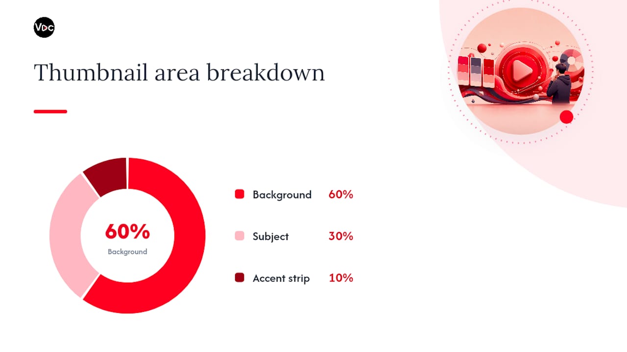
- Background takes up roughly 60% of the frame using your neutral or primary color, often a blurred scene or solid block.
- Subject treatment (a screenshot, object, or graphic) sits in the remaining visual space, usually cropped tight and positioned off-center.
- Text box uses your secondary color as a solid shape behind the title text, never text floating directly on a busy background.
- Accent strip applies your 10% color to one small element, like an arrow, circle, or underline, that draws the eye toward the click trigger.
Avoid pairing colors that sit close together in saturation and brightness, like medium blue text on medium gray, or dark green on black. These pairings look fine at full size and disappear the moment YouTube shrinks them for mobile. Stick to combinations where one color is clearly light and the other clearly dark.
Pro Tip: Add a 3 to 4 pixel stroke or drop shadow behind your title text using your darkest neutral color. It costs you thirty seconds and it’s the difference between text that reads instantly and text viewers have to squint at.
Run through this checklist before you publish:
- Text is legible at thumbnail size on both light and dark device themes
- No more than three colors appear in the actual composition, even if your palette has five
- The accent color appears only once or twice, never scattered across the frame
Where Else Should Your Colors Show Up on Your Channel?
Your thumbnails carry the heaviest branding load, but the rest of your channel art should echo the same palette without repeating it word for word.
- Banner: use your full palette only if you’re running a seasonal or campaign banner; otherwise, stick to a single dominant color with your logo and channel name inside YouTube’s safe zone (the centered area that survives cropping across desktop, mobile, and TV).
- Profile image: keep it to one bold shape or letterform in your primary color, with a border in your secondary or neutral tone so it stays crisp at the tiny sizes it renders at in comments and subscriptions feeds.
- Overlays: apply your accent color sparingly, on a lower third, a subscribe bug, or a countdown timer, never as a full-screen tint that fights with your footage.
- End screens: use motion accents (a pulsing border or sliding highlight) in your accent color to draw attention to the subscribe button or next-video card without redesigning the whole screen.
The goal across all of these is restraint. A channel that uses its accent color on every single asset stops making that color feel special, which defeats the purpose of having one.
Is Your Color Scheme Accessible to All Viewers?
Overlay and thumbnail text should hit strong contrast between foreground and background, following the W3C’s WCAG contrast guidance, which sets a 4.5:1 ratio as the baseline for normal text and a lower bar for large, bold text. Thumbnails aren’t legally bound by WCAG, but the same math determines whether your title reads at a glance.
Color blindness affects roughly 8% of men and 0.5% of women, which means red-and-green pairings that look distinct to you may look nearly identical to a meaningful slice of your audience. Add outlines, icons, or shape differences to any element where color alone carries the meaning.
- Check contrast with a free online contrast checker before publishing
- Add a border, icon, or arrow, not just a color shift, to highlight important CTAs
- Preview thumbnails and profile images at real feed size, on mobile, and in dark mode, since compression and scaling change how colors render
How Do You Test Color Changes and Measure What Works?
Treat your palette like any other creative variable. Change one element at a time, run a control against a challenger, and let the data decide instead of your gut.
- Pick one variable. Swap only the accent color or only the text box color between your control thumbnail and your test version, following the same isolated-variable approach recommended for creative testing.
- Run it for 1 to 2 weeks across a matched set of videos, ideally similar topics and publish times, so outside factors don’t skew results.
- Track impressions CTR, 3 second view rate, and average view duration in YouTube Studio. CTR tells you if the thumbnail earned the click; the other two tell you if the color choice set the right expectation.
- Roll out the winner channel-wide once you see a consistent lift across multiple videos, not just one outlier.
Small, isolated tests beat big redesigns almost every time, because you actually learn which color did the work.
Who’s Behind This Guide and Where Can You Learn More?
This guide comes out of Voclify’s ongoing work helping faceless creators build recognizable channels without a face to anchor the brand. If you want to go deeper, our guides on channel branding fundamentals, color grading for beginners, and when to run a rebrand cover the adjacent decisions this article doesn’t have room for.
The toolkit has supported many creators who have collectively gained millions of subscribers using script, thumbnail, and branding tools together. If you’ve already picked a palette from the sections above, the fastest next step is running those hex codes through the brand studio to generate a matching logo and banner in one pass.
What Should Your Style Guide Actually Include?
A style guide only works if it’s short enough that you’ll actually check it before publishing. Skip the 20-page brand book. Build a single page, a doc, a note, a pinned image, whatever you’ll open in ten seconds, with these five things on it: your primary, secondary, and accent hex codes; your font choices and sizes for thumbnail text; your logo files in both square and horizontal formats; one example thumbnail that shows the template applied correctly; and a short list of color pairings to avoid.
Documenting exact codes matters more than it sounds like it should, because small hue drift happens fast. You pick #1D4E89 for a tutorial channel, and three months later you’re eyeballing “a similar blue” from memory. That’s how channels lose visual consistency without anyone noticing until subscribers start commenting that thumbnails look different.
If you’re running the channel solo, a shared folder with your palette file and three or four template examples is enough. If you’re a small agency managing multiple channels, that style guide becomes non-negotiable. Editors and thumbnail designers rotate, freelancers come and go, and the only thing keeping ten videos a month visually consistent is a document that spells out exactly which hex codes go where. Update it the moment you change anything, and treat it as the single source of truth every contractor gets on day one.
How Have YouTube’s Own Brand Colors Changed Over Time?
YouTube’s own visual identity has shifted several times since the platform launched in 2005, moving from an early, busier logo treatment toward the simplified red play-button mark most viewers recognize today. That evolution reflects a broader pattern across nearly every major platform: strip complexity out, lean harder on one or two signature colors, and let the mark work at tiny sizes.
That’s the exact lesson worth borrowing for your own channel, even though your brand colors and YouTube’s platform colors are two different things entirely. The direction of travel matters more than the specific palette: simpler wins. A channel logo with five colors and three gradients might look impressive full-size on a design software canvas, but it turns into mush at the 88x88 pixel size it actually renders at in the YouTube app. Pick fewer colors, make them bolder, and resist the urge to add “just one more” accent shade because a logo tool made it easy.
What Do Your Colors Signal Psychologically to Viewers?
The channels that dominate specific niches tend to lean on the same handful of colors, and that’s not a coincidence. Red shows up constantly in gaming, reaction, and high-energy content because it reads as excitement and urgency. Blue dominates finance, tech reviews, and education because viewers associate it with trust and competence, which matters when someone’s deciding whether to take your advice on where to put their money. Yellow shows up as an accent almost everywhere because it signals optimism and grabs attention without needing to be a whole background.
Green skews toward growth, finance, and outdoor content, tapping into associations with money and nature depending on context. The mistake I see constantly is creators picking a color because it’s their personal favorite rather than because it matches what their content promises. A true crime channel running a cheerful yellow-and-pastel palette sends a mixed signal before the video even starts.
Analogous color schemes, colors that sit next to each other on the wheel, feel calm and unified, which suits slower, narrative-driven content. Complementary schemes, colors that sit opposite each other, generate more visual excitement but wear out a viewer’s eye faster if you lean on them in every single thumbnail. Save complementary pairings for your highest-stakes videos and use a calmer analogous palette as your everyday baseline.
What Color Trends Are Showing Up by Niche Right Now?
Gaming channels have pushed further into neon accents on near-black backgrounds over the past couple of years, borrowing the aesthetic of the games themselves. Purple and cyan accents on dark backgrounds now show up almost as often as the classic yellow-on-black combination in that space.
Finance and business channels have mostly stayed anchored to blue and green, but the shade has shifted noticeably brighter and more saturated than the muted navy tones that dominated earlier waves of YouTube finance content. That brighter blue reads as more modern without abandoning the trust signal the color carries.
Faceless storytelling and true crime channels lean heavily on desaturated, moody palettes, dark grays, muted reds, and near-black backgrounds, which matches the tone of the content and separates them visually from the brighter, louder gaming and entertainment space.
Listicle and “top 10” style channels have gone almost universally high-contrast, favoring the yellow-black-white combinations that consistently test well for visibility in a crowded feed. If you’re launching a channel in a niche that already has an established leader, study their palette before you copy it. Sometimes the smarter move is deliberately choosing the opposite end of the color wheel so your thumbnails don’t blend into a subscriber’s feed alongside the channel they already watch.
An Honest Take on Building YouTube Channel Colors That Actually Work
Most advice on this topic treats color choice like a branding exercise, something you do once, in a mood board, before you ever upload a video. That’s backwards. Color is a testing variable, the same as your title or your hook. The creators who win the thumbnail game aren’t the ones with the most tasteful palette. They’re the ones who picked something reasonable, fast, and then let three months of CTR data tell them whether it actually works for their audience.
The conventional wisdom oversells uniqueness. You don’t need a palette nobody’s ever seen. You need one that’s legible at 128 pixels wide and consistent across fifty videos. Distinctiveness matters less than most creators think; recognition matters more. Those aren’t the same thing.
If I had to prioritize one move for someone starting today, it’s this: pick a palette from a proven category (warm, cool, or high-contrast), lock the hex codes down in writing, and stop touching them for at least twenty videos. Consistency compounds. Indecision doesn’t.
— Arnas
Get Your Palette Into a Thumbnail Faster With Voclify
Once you’ve picked your hex codes, the bottleneck usually isn’t the palette anymore. It’s the hours spent rebuilding the same template in a design tool for every single video. This toolkit was built specifically for faceless creators who need to move from color codes to a finished, on-brand thumbnail without opening five different apps.
The thumbnail generator lets you enter your primary, secondary, and accent hex values once and generate on-brand template options from real proven styles, so every thumbnail you publish keeps the contrast and consistency this guide covers without redoing layout work from scratch. Pair it with the brand studio to push the same palette across your logo and banner in one pass. For creators managing multiple channels, this can help a style guide be actually followed rather than ignored in a shared folder.
Start by generating one thumbnail template from the palette you picked above at Voclify and see how it compares to your current click-through rate over the next two weeks.
Sources
- The Psychology of Colors in YouTube Branding
- Color psychology: Make Creatives That Convert
- YouTube Thumbnail Color Psychology: Which Colors Drive More Clicks
Recommended

Get more of this in your Google results
Add voclify.io as a preferred source and Google shows you more of our articles in Search and AI Mode.