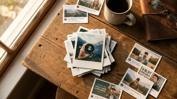
A high-CTR thumbnail comes down to three things: one clear focal subject, usually a face showing real emotion or a single unmistakable object, paired with high-contrast colors and no more than three to five bold words that stay readable at a glance. Design it small before you design it big. Shrink the draft down to postage-stamp size to check legibility, then let YouTube’s own Test & Compare tool tell you if it actually works on real viewers.
TL;DR:
- Using high-contrast colors, expressive faces, and minimal text that is readable at 120 to 160 pixels drastically improves click-through rates.
- Thumbnails should stay within YouTube’s recommended specs of 1280 by 720 pixels, under 2 MB, with key elements placed in the safe zone.
- Testing thumbnail variations on real viewers over one to two weeks prioritizes watch time and retention, not just initial clicks.
- Building and applying a small set of consistent templates improves recognition and engagement more than relying on individual creative ideas.
- AI tools like Voclify can generate tested thumbnail variations quickly, supporting scalable, template-based workflows for faceless content channels.
What Makes Great YouTube Thumbnail Design Work
Good thumbnail design is really just applied psychology with a few hard technical limits bolted on. YouTube’s own upload specs set the outer boundary: the platform recommends 1280 by 720 pixels at a 16:9 ratio, with the file kept under 2 MB in JPG, PNG, GIF, or WebP format. Stay inside those specs and you avoid the blurry, stretched, or rejected uploads that plague creators who guess at dimensions.
Composition matters just as much as the file itself. YouTube overlays a duration stamp in the bottom right corner and, on some layouts, channel info near the bottom edge. Anything important sitting in that safe zone gets buried under those overlays the moment your video goes live.
Color and contrast decide whether a thumbnail gets noticed in a feed packed with competitors. Pick two or three colors, lean on complementary pairs (blue against orange, purple against yellow), and outline or shadow your text so it separates from a busy background. Testing consistently shows high-contrast thumbnails with concise text outperform muted, cluttered designs.
Typography needs the same discipline. Use a heavy, condensed font, add a stroke or drop shadow, and cap your word count at five or fewer. Test the text at roughly 120 to 160 pixels wide, the size most viewers actually see on a phone, before you ever hit publish.
Faces do heavy lifting for a reason. Analyses of top-performing videos consistently find that thumbnails with faces and strong emotion correlate with higher view counts than neutral or object-only designs. A raised eyebrow, an open mouth, wide eyes: these read as a stand-in for the emotional payoff of the video itself, and viewers respond to that shortcut instantly.
Statistic Callout: Single-subject focus, expressive faces, and minimal text are recurring traits across high-performing thumbnails, and each one correlates independently with a stronger click-through rate.
Quick reference for the core rules:
- Canvas: 1280×720 px, 16:9, under 2 MB, JPG/PNG/GIF/WebP.
- Keep faces, text, and key objects inside the central safe zone.
- Limit your palette to 2 to 3 colors with strong contrast.
- Cap text at 3 to 5 words, stroked or shadowed for separation.
- Test legibility at 120 to 160 px wide before uploading.
Pro Tip: Shoot your expression reference photo separately from your regular filming setup. A dedicated, well-lit “reaction shot” session gives you a bank of exaggerated expressions to pull from for every thumbnail, instead of scrambling through footage looking for one usable frame.
A Step-by-Step Workflow for Designing Every Thumbnail
Treat thumbnail creation as a repeatable process, not a one-off scramble after you finish editing. Here’s the sequence that keeps quality consistent across every upload.
- Find the hook. Watch your rough cut and identify the single strongest moment: the biggest surprise, the clearest before/after, the most emotional reaction. That moment is your visual concept.
- Set the canvas. Open a 1280×720 px document and choose your background treatment: a blurred still, a high-contrast solid color, or a cropped action shot.
- Place the subject. Position your face or object off-center using the rule of thirds, leaving room for text without crowding the frame.
- Add text and branding. Overlay your three-to-five-word phrase and drop in consistent brand elements, like a logo corner or signature color strip.
- Run the postage-stamp test. Shrink the file to roughly 120 to 160 px wide and confirm the subject and text are still instantly readable. If anything blurs together, go back and simplify before moving on.
- Export and upload. Save as JPG or PNG, confirm the file is under 2 MB, and upload it through YouTube Studio’s video details page under the custom thumbnail option.
- Check early performance. Compare your first-hour or first-day CTR against your channel average, and flag any video with room to test as a future A/B candidate.
A few things to keep in mind at each stage:
- Blur or darken busy backgrounds so your subject pops without extra editing work.
- Save your brand template as a layered file so future thumbnails start from a working base, not a blank canvas.
- Never rely on a desktop preview alone. Most viewers browse on mobile, where your thumbnail shrinks dramatically.
Reusable Thumbnail Templates and a Quick-Copy Checklist
Building from a small set of repeatable layouts speeds up production and keeps your channel visually recognizable. Three formats cover almost every content type.
Face-led template: a tight close-up crop of your face or a presenter’s face, showing exaggerated emotion, positioned on one side with three or fewer words of text on the other. This layout dominates reaction content, vlogs, and personal commentary channels.
Object-led template: a single product, tool, or action shot filling most of the frame, shot against a clean or blurred background, with a short benefit-driven phrase layered on top. Reviews, unboxings, and tutorials lean on this format because the subject itself is the payoff.
Text-led template: a bold graphic element (an arrow, a circle, a big number) paired with a short punchy phrase, used when no single image captures the hook. Faceless channels and list-style videos rely on this the most.
| Element | Requirement |
|---|---|
| Dimensions | 1280×720 px, 16:9 |
| Focal area | Central safe zone, avoiding bottom-right timestamp overlay |
| Contrast | 2 to 3 colors, complementary pairing |
| Text limit | 3 to 5 words, stroked or shadowed |
| Branding | Consistent logo placement, same corner every upload |
Applying the same layout logic across uploads builds instant recognition, and consistent branded templates measurably increase recognition and subscriber conversion over time. For Shorts, shift the safe zone upward since the platform’s UI overlays sit lower on the vertical frame. For faceless channels, lean harder on the object-led and text-led templates, using bold typography and strong props to replace the emotional pull a face normally provides.
How Do You Test Thumbnails With Real Data?
YouTube’s built-in Test & Compare feature runs up to three thumbnail (or title) variations against real viewers and picks a winner based on watch-time share rather than raw clicks alone. That distinction changes how you should think about testing altogether.
Run one test at a time. Change only the expression, only the text, or only the color palette between variants, never all three at once, or you won’t know which change actually moved the needle. Expect the experiment to need one to two weeks to gather a reliable sample, faster on larger channels with more daily impressions, slower on newer ones.
Watch the outcome closely. A thumbnail that pulls more clicks but tanks watch time is often over-promising, and Test & Compare will correctly favor the design that keeps viewers watching instead. Chasing the highest CTR number without checking retention afterward is one of the fastest ways to train your own algorithm against you, an idea worth pairing with broader audience retention strategy.
- Test one variable per experiment: expression, text, or color.
- Give it one to two weeks, adjusting for your channel’s impression volume.
- Prioritize watch-time winners over pure click winners.
- Reapply a proven winning style to older back-catalog videos to reset their distribution.
Pro Tip: Once a template wins a test, don’t just use it once. Reapply the same visual formula to three or four older videos in the same category and watch whether their impressions climb again. Winning templates often work like a reset button for buried catalog content.
Thumbnail Mistakes That Quietly Kill Your Click-Through Rate
Most underperforming thumbnails share the same handful of problems, and each one has a fast fix.
- Too much text. If a viewer needs more than a second to read it, cut the word count in half and increase the font size on what remains.
- Weak contrast against YouTube’s white or dark interface. Add a stroke or shadow to text, or swap your palette for something that pops against both light and dark mode.
- Designing only at full size. A thumbnail that looks great on a 27 inch monitor can turn to mush at 120 to 160 pixels wide, so the postage-stamp test isn’t optional, it’s the final quality gate.
- Overpromising with clickbait. A thumbnail that pulls a click but doesn’t deliver on the video’s actual content tanks watch time and trains the algorithm to stop recommending you. Match the promise on the thumbnail to what the video actually delivers.
How Voclify Fits Into a Faceless Creator’s Thumbnail Workflow
Faceless channels face a specific problem: no on-camera personality to lean on for that emotional, face-led pull. Voclify was built around that exact gap. Its AI thumbnail generator draws from real proven styles to produce object-led and text-led candidates fast, without a design background or a stock photo subscription.
The toolkit pairs a template library with a dedicated thumbnail text generator, so the short, punchy phrasing that typically takes several drafts to nail comes out ready to test on the first try. Voclify has been trusted by over 1,000 creators, some of whom have collectively grown their channels by millions of subscribers using its automated content workflows.
Inside the step-by-step process above, Voclify slots in at the build stage: generate several thumbnail variations from one concept, apply your saved brand template for consistent colors and logo placement, then export the strongest two or three candidates to run through YouTube’s own Test & Compare. That combination, AI-assisted variation plus native testing, is what turns thumbnail design from a one-off guessing game into a repeatable optimization habit.
- AI thumbnail generator built from real high-performing styles.
- Thumbnail text generator for concise, stroke-ready phrasing.
- Brand template library for consistent logo and color placement.
- Workflow automation that fits faceless-channel production at scale.
Why Templates Beat Talent for Consistent Thumbnails
The conventional advice on thumbnail design treats it as an art project: find your creative eye, study color theory, develop an instinct for what pops. That advice isn’t wrong, exactly, but it buries the more useful truth. Consistency beats individual genius. A creator with three solid templates and a testing habit will outperform a creator chasing a fresh masterpiece every upload, because the second creator burns hours on decisions that a template already answers.
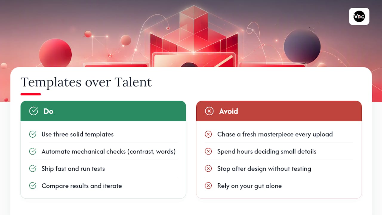
What gets underestimated is how much of this is mechanical, not creative. Contrast ratios, word counts, safe zones, mobile legibility: these are checkable, testable, fixable. The emotional read on a face is the one genuinely subjective piece, and even that benefits from exaggeration over subtlety.
Where creators go wrong most often is stopping at the design step and skipping the test. A thumbnail you feel good about and a thumbnail that actually holds watch time are frequently two different images. Build from a template, ship it fast, and let Test & Compare settle the argument your gut can’t.
— Arnas
Put a Repeatable Thumbnail Process to Work Today
Building three solid templates and testing them properly takes real time, the kind most creators would rather spend on scripting and filming. Voclify’s AI thumbnail generator exists to close that gap: pick a style pulled from real proven layouts, generate variations in minutes, and keep your logo and color scheme consistent across every upload without rebuilding a template from scratch each time.
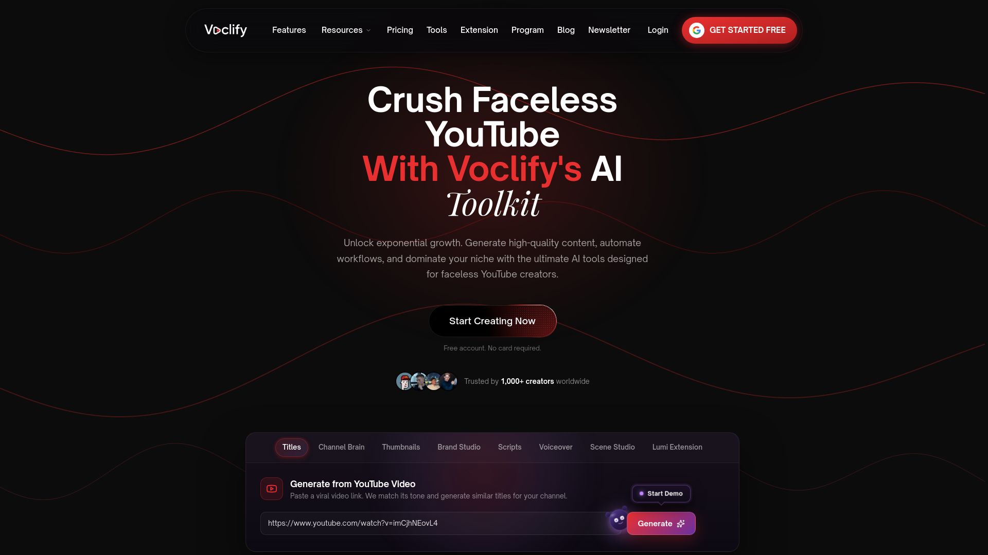
The generator pairs naturally with Voclify’s thumbnail text tool for punchy, stroke-ready phrasing and its broader suite for scripts, titles, and voiceovers, so your entire upload can move through one connected workflow instead of five separate apps. If you’re managing a faceless channel and tired of the back-and-forth between concept and export, start a project with the thumbnail generator and export your first batch of tested candidates before your next upload deadline.
Sources
- How to Create a YouTube Thumbnail That Actually Gets Clicks (2026 Guide)
- How to Create Scroll-stopping YouTube Thumbnails (+ Tips from Top Creators)
- YouTube Thumbnail Guide: How to Make Thumbnails That Get Clicked - Alan Spicer
Recommended

Get more of this in your Google results
Add voclify.io as a preferred source and Google shows you more of our articles in Search and AI Mode.